I was pointed to a data collaboration portal today that has me wondering. Since we know that we are not tracking COVID-19 deaths all that well, I’ve been interested in what evidence is available about excess mortality — deaths above baseline patterns over time.
24 European countries have been pooling their mortality statistics and modeling trends for some years: Austria, Belgium, Denmark, Estonia, Finland, France, Germany (Berlin), Germany (Hesse), Greece, Hungary, Ireland, Italy, Luxembourg, Malta, Netherlands, Norway, Portugal, Spain, Sweden, Switzerland, UK (England), UK (Northern Ireland), UK (Scotland), and UK (Wales).
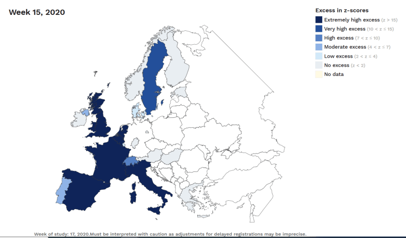
You can now look at the mortality data to try to get a better handle on the effects of all the change wrought by COVID-19 and our responses to it. It seems clear now that countries with early shelter-at-home policies relative to cases have, so far, avoided deaths that measure statistically as a “substantial increase” while those that did not, or had difficulty with early implementation (like Italy), have paid a high price in excess mortality. You can see this by noting which of the countries’ paths go above the red “substantial increase” line in the country charts and those that don’t. (I’ve put these figures at the end because they need to be zoomed in on – or just go to the euromomo.eu site and look at the graphs there – I know you’ll want to).
For those not used to thinking in weeks (or simply have lost track of them) the first stay-at-home lock downs of one degree or another were about week 11, with the UK finally starting in week 13. Sweden famously has not been told to shelter at home.
There is a lot of interesting information, but I have at least two new questions that I didn’t have 10 minutes ago, and no real answers.
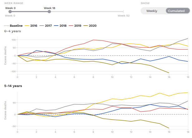
1. The two graphs below show lower than average excess mortality for 0-4s and 5-14s for 2020 so far, with the divergence from normal growing considerably with shelter-at-home school closures. Why are under-15s dying at much lower rates than usual for this time of year? What will society do with answers to that question (if we can get them)?
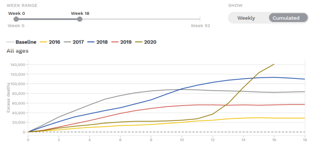
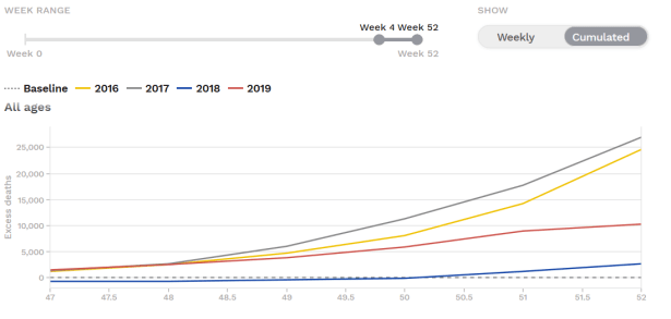
2. The first graph below shows all excess deaths in the first 10 weeks of 2020 were on the low side (but within the range for 2016-2019), and the jump starting in weeks 11-12 is startling. The second graph shows that excess mortality was also on the lower side in the last two months of 2019. How does this square with our changing timeline for first infections? Is there a longer lag between infection and symptoms/death than we think? I have no idea.
From above discussion: Country z-scores. euromomo.eu. Left hand side graphs are countries whose excess mortality rates exceed the “substantial increase” line, Middle graphs may be outside normal range but not “substantial increase, while Right hand side graphs do not extend from normal range since about week 2, 2020. LHS top to bottom: UK (England), UK (Scotland), UK (Northern Ireland), Belgium, France, Italy, Netherlands, Spain, Sweden, Switzerland; Middle from top to bottom: Austria, Denmark, Luxembourg, Malta, Portugal; RHS top to bottom: Estonia, Finland, Germany(Berlin), Germany(Hesse), Greece, Hungary, Ireland, Norway. Ireland even falls below ‘normal range’ in later weeks.


