
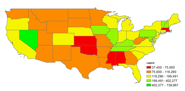
This map is a challenge for you. Please make your best guesses as to what it represents in the comments. Then I’ll write more about it and how I think it might help focus efforts for making the world healthier, wealthier and wiser. Not Shown: AK is red; HI is yellow.

When will we get the answer? It hints something about coal in the and inequality in the title.
LikeLike
Soon – deciding how much detail to expand upon it…
LikeLike