
My last post was actually a map of maximum compensation values for the lost use of a hand under worker’s compensation rules across the states. Were you close?!
One of the things I find most interesting and informative about this map and these figures is that their differences are built on a history of bargaining and opportunities for both industry and labor. These days, most American jobs don’t have a lot of risk of losing use of one’s body parts. And those that do may well be excluded from the insurance program (financed by industry paying insurance premiums under state rules) – Groups of workers that are excluded include “Farm workers, domestic workers, employees of small businesses, and people who are self-employed are excluded from workers’ comp in many states; Texas and Oklahoma allow any employer to opt out of the system altogether; and a growing number of health conditions related are excluded from coverage across many states.”
The war on workers’ compensation has been ongoing, fueled by industry’s complaints that the system is costly to them. This is in spite of the significant decline across states in the premiums, shown here:
Insurance premiums by state over time – Interactive graph
You can find more information on body part valuations under worker’s compensation in different states here:
Worker’s Compensation Benefits by limb
But it is difficult to find comparative data across the states in one easy format. The US Dept of Labor has the cases, claims, denials and expenditures by state here (Dept. of Labor Office of Workers’ Compensation Programs) or here (DOL Bureau of Labor Statistics), but you can only look at one state at a time, and some states don’t have data.
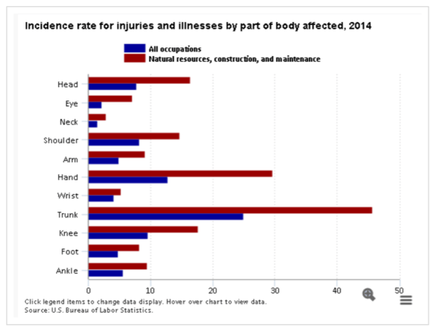
You can look across industries, and see that the industrial categories of natural resources, construction, and maintenance are, unsurprisingly, the biggest source of workers’ comp claims by far. The chart below (from the BLS) compares the differences.
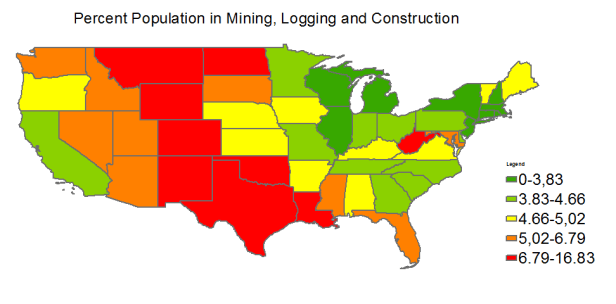
How does employment in these sectors look by state today (2013-2015 average, data from BLS; Note AK is Red, HI is orange)?
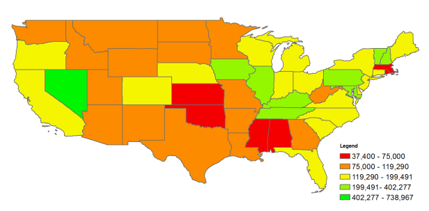
It’s not a perfect correlation to the workers’ compensation payments for hands, shown again here (recall AK is red, HI is yellow):
This reflects the changing economic conditions across the states over many years. We can see, however, that the states that are red or orange in both maps are still heavily dependent on natural resources while they do not have the worker’s compensation support to back up the higher expected industries – these are the areas that have most accepted ‘jobs over safety and insurance.’ And, they are the states that are currently acting to choose low valuation of health and well-being (for themselves and others) by accepting jobs over the environment – e.g. the removal of stream protections from coal mining operations will most affect W. Virginia – an East Coast outlier in both heavily reliant on natural resource extraction and having low valuations for lost use of body parts.
On the other hand, Massachusetts’ industrial days are mainly in the far past. States like Massachusetts with low workers’ compensation levels but low employment in industries more likely to use workers’ compensation show evidence of being able to leave behind concerns about health and insurance (and not raise rates) in the economic transition to a diversified economy.
We need to find ways to defend the value of human’s health and environment as we transition from natural resource extraction to less damaging ways of living. The long arc of industrial history reflected here shows that we have too often taken advantage of lower valuations for health and environment to perpetuate damages to both individuals and the collective citizenry. Continuing in this vein will only deepen the nation’s divides.
